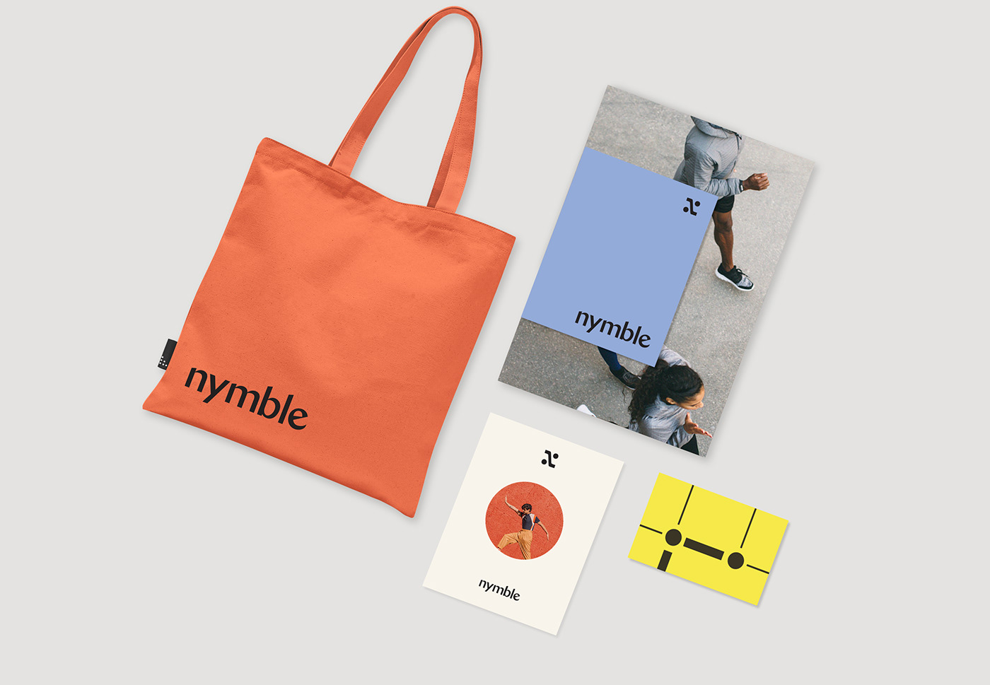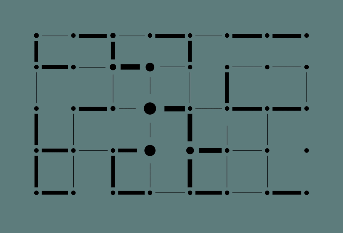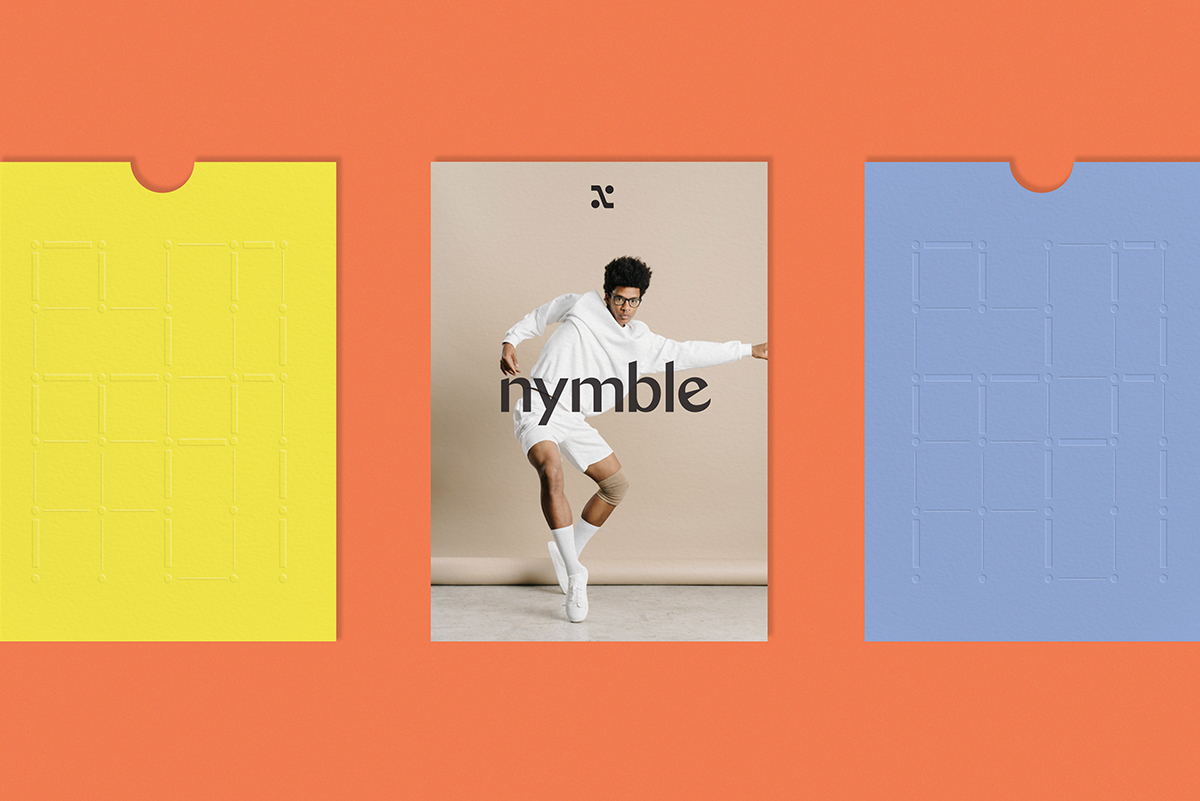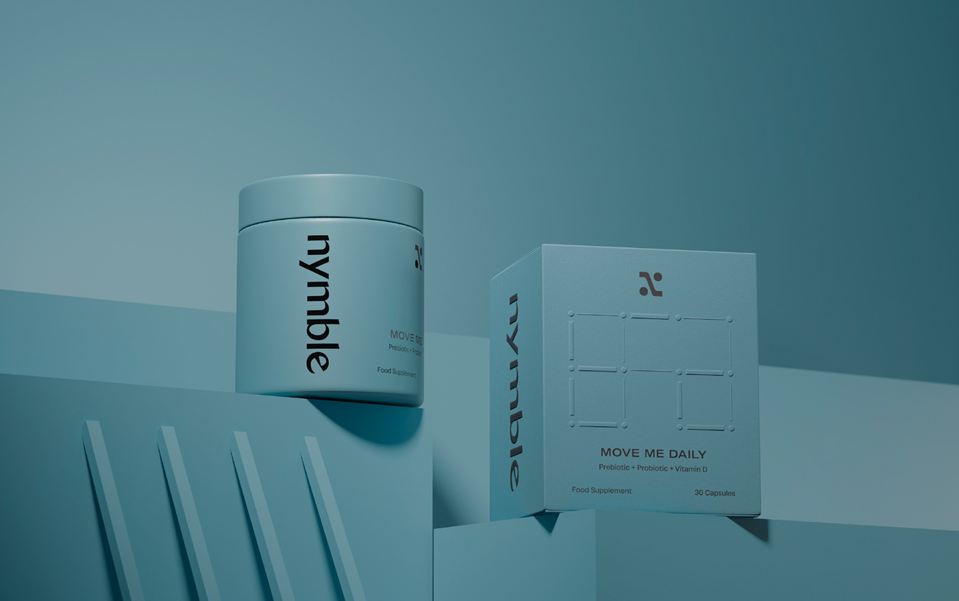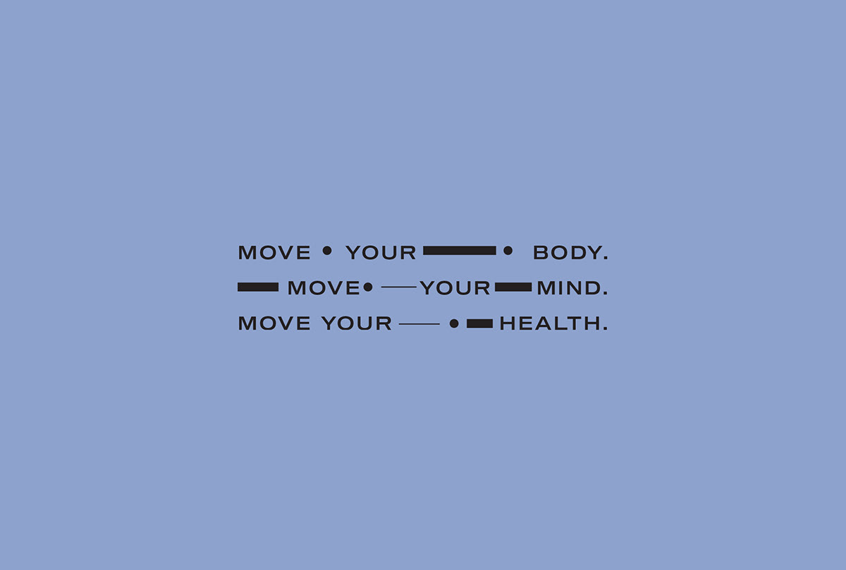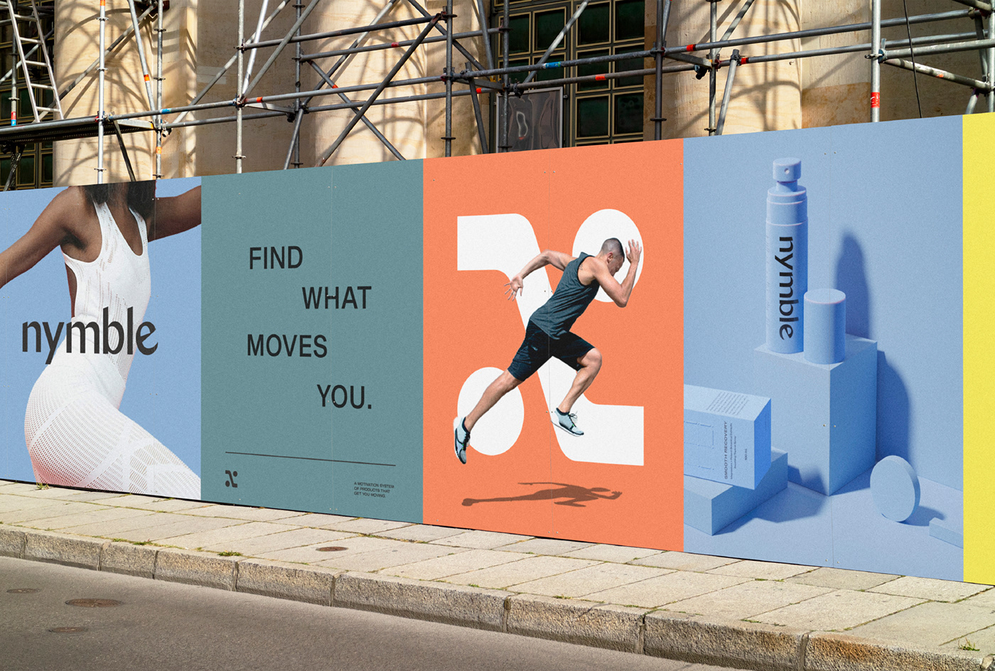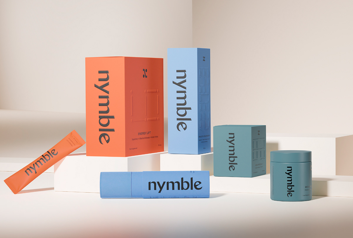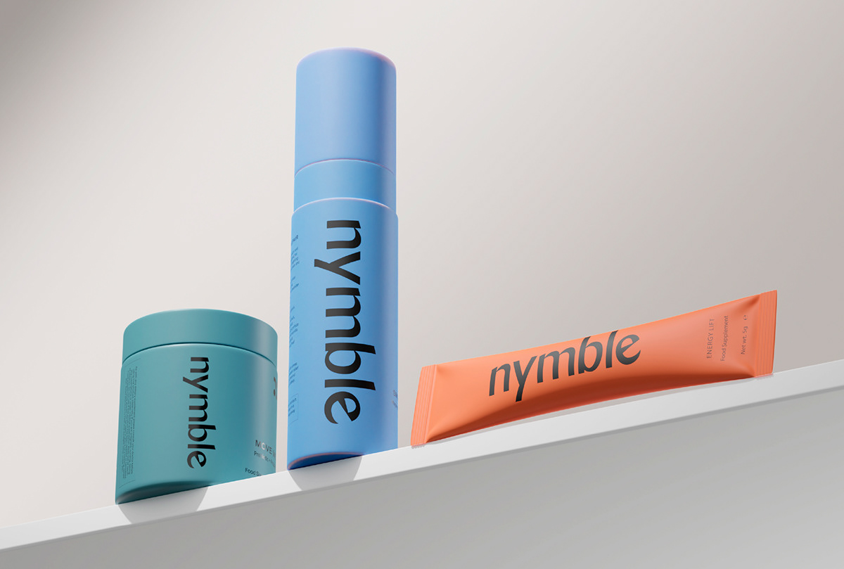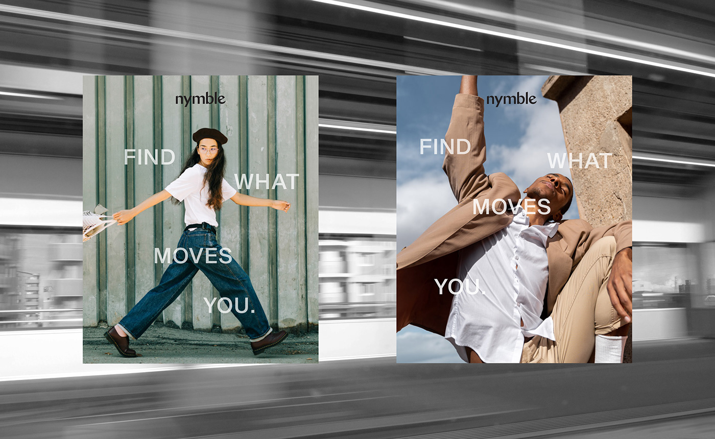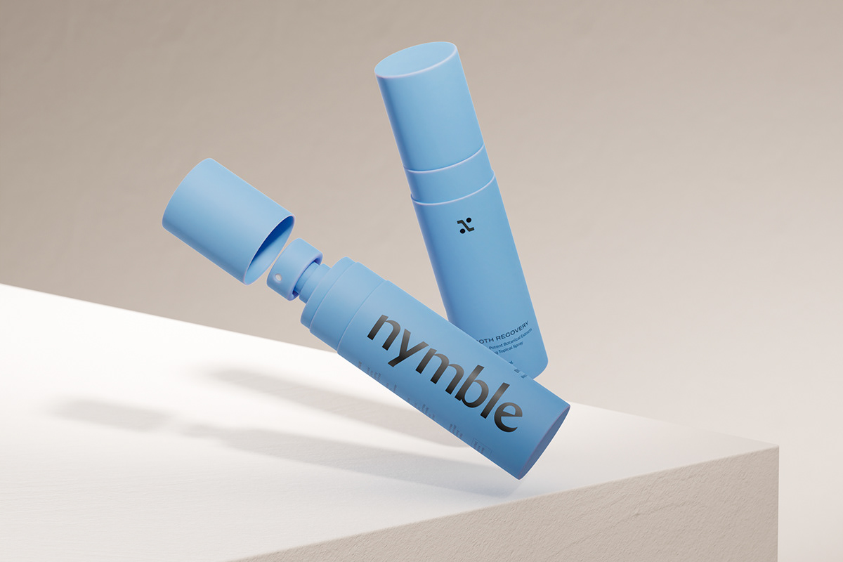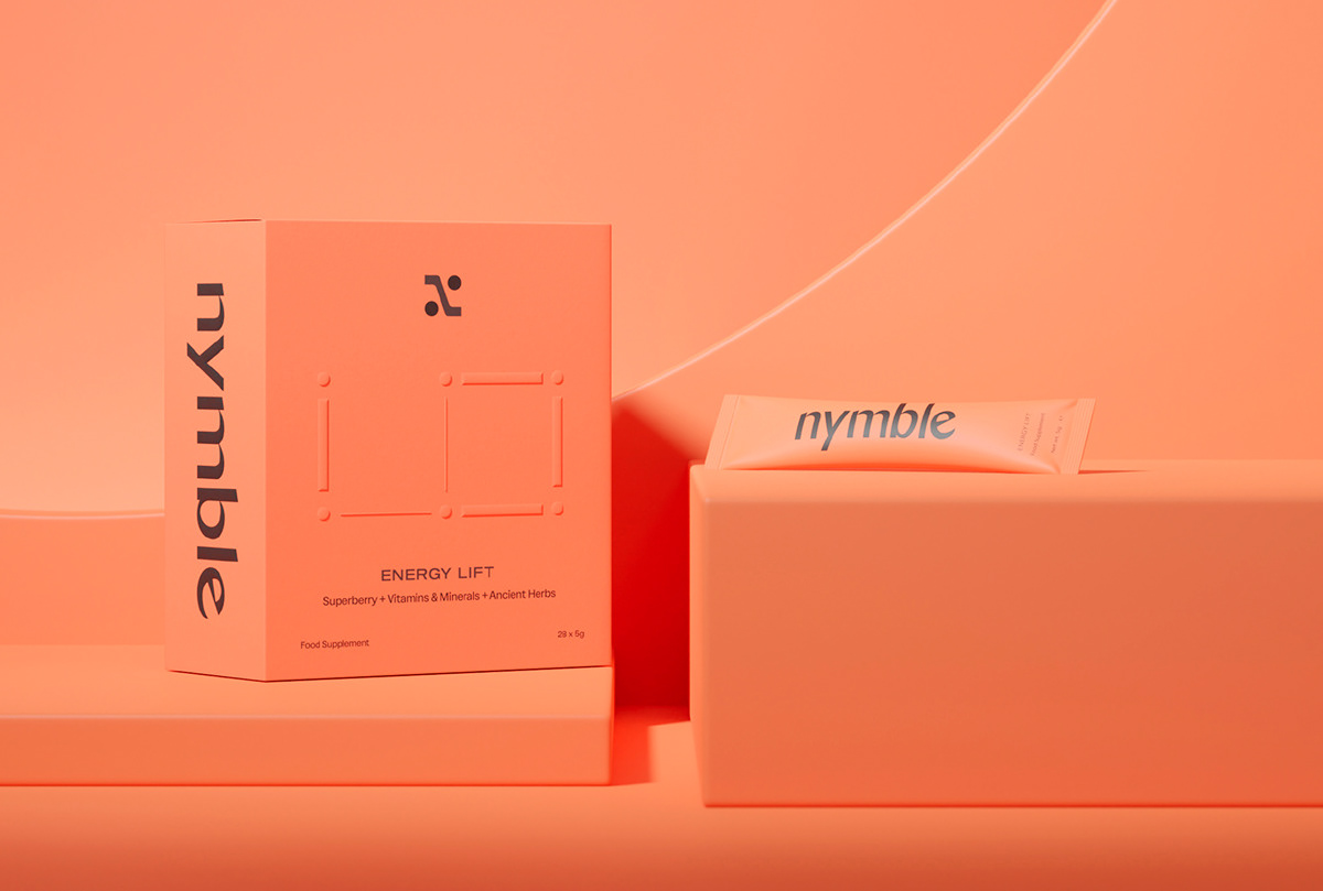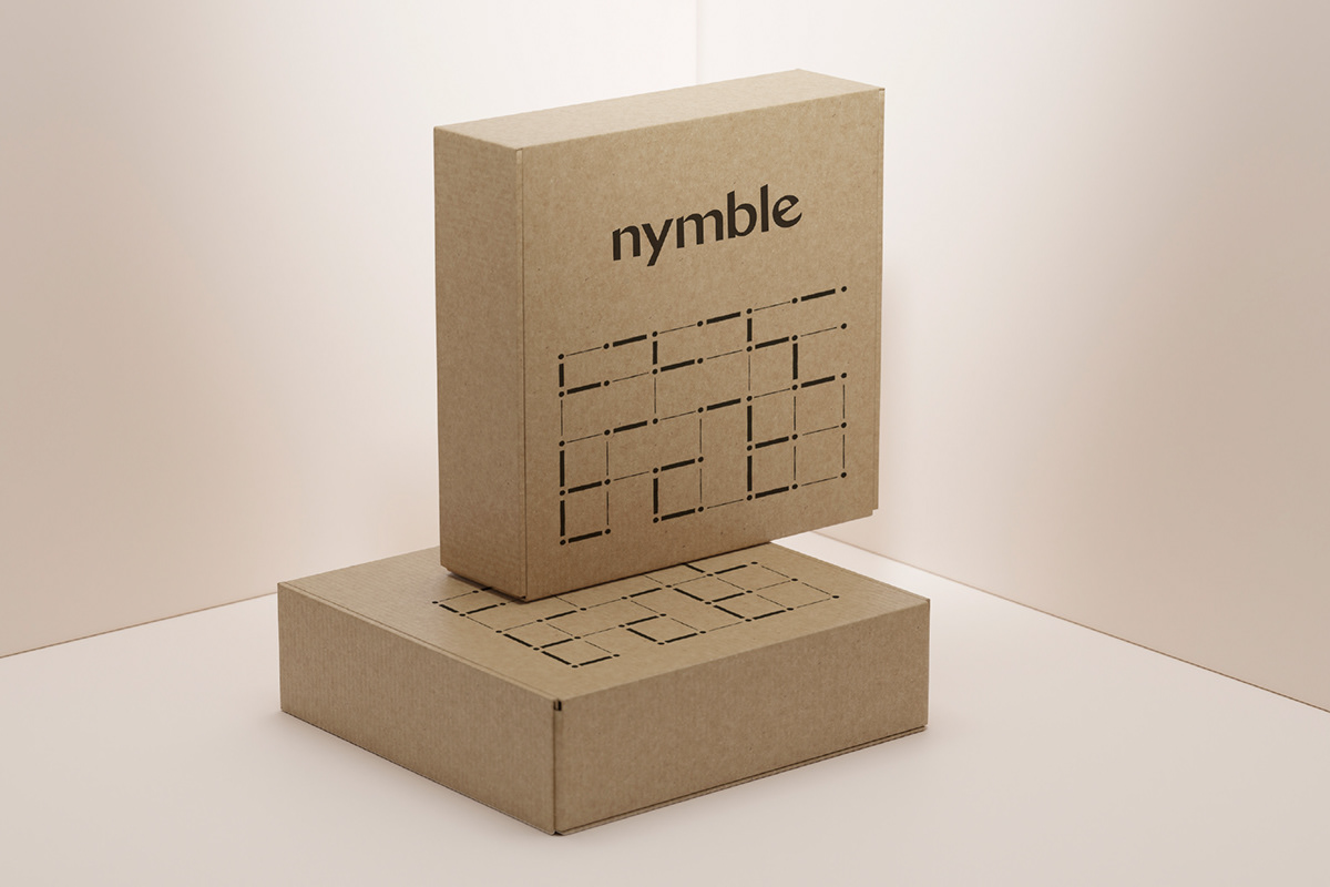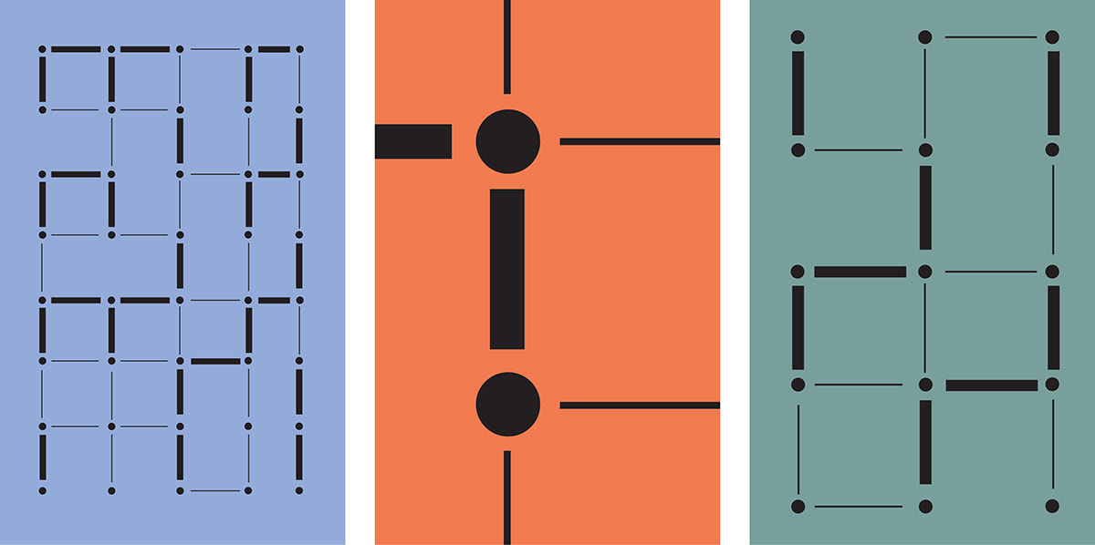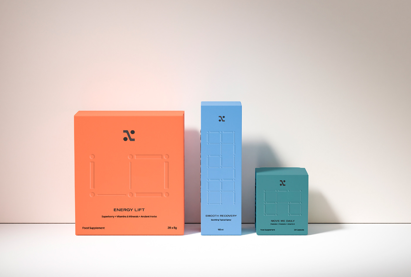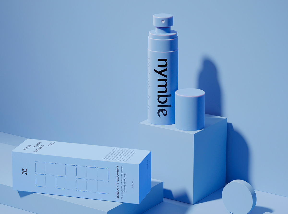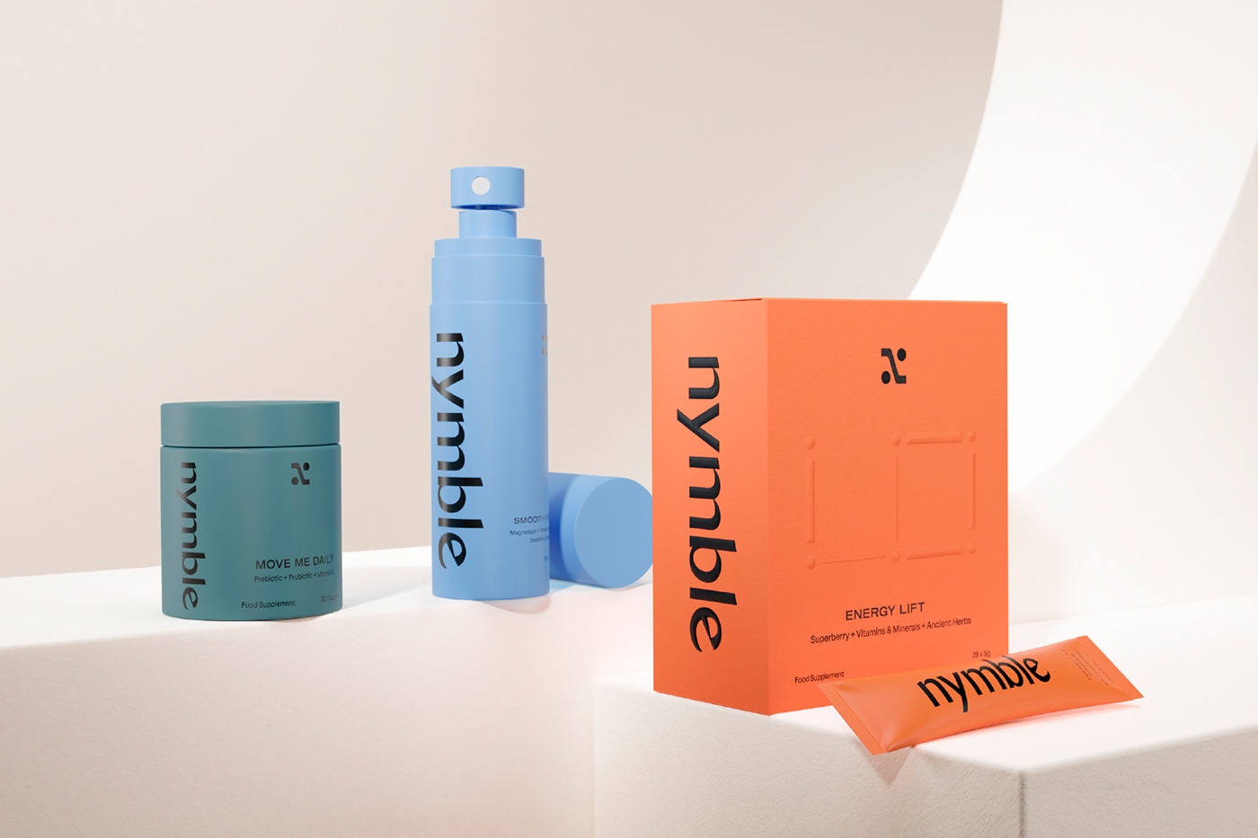

Nymble came to us with a wellness suite focused on getting more people moving. From naming and strategy to messaging and identity, we helped them create a brand culture that changes the fitness conversation from how we look to how we feel. And empowers people to move for the right reason—their health—while removing barriers like sluggishness, fog and fatigue.The logomark is built upon a stylish sans serif that is both clean and sophisticated. Each letterform has beautiful transitions that give the mark as a whole a sense of movement. Inspired by body movement, the Nymble 'N' submark embodies the spirit of the brand in a clean and elevated way. The Nymble grid pattern represents health journeys and individual pathways to greater health and wellness.